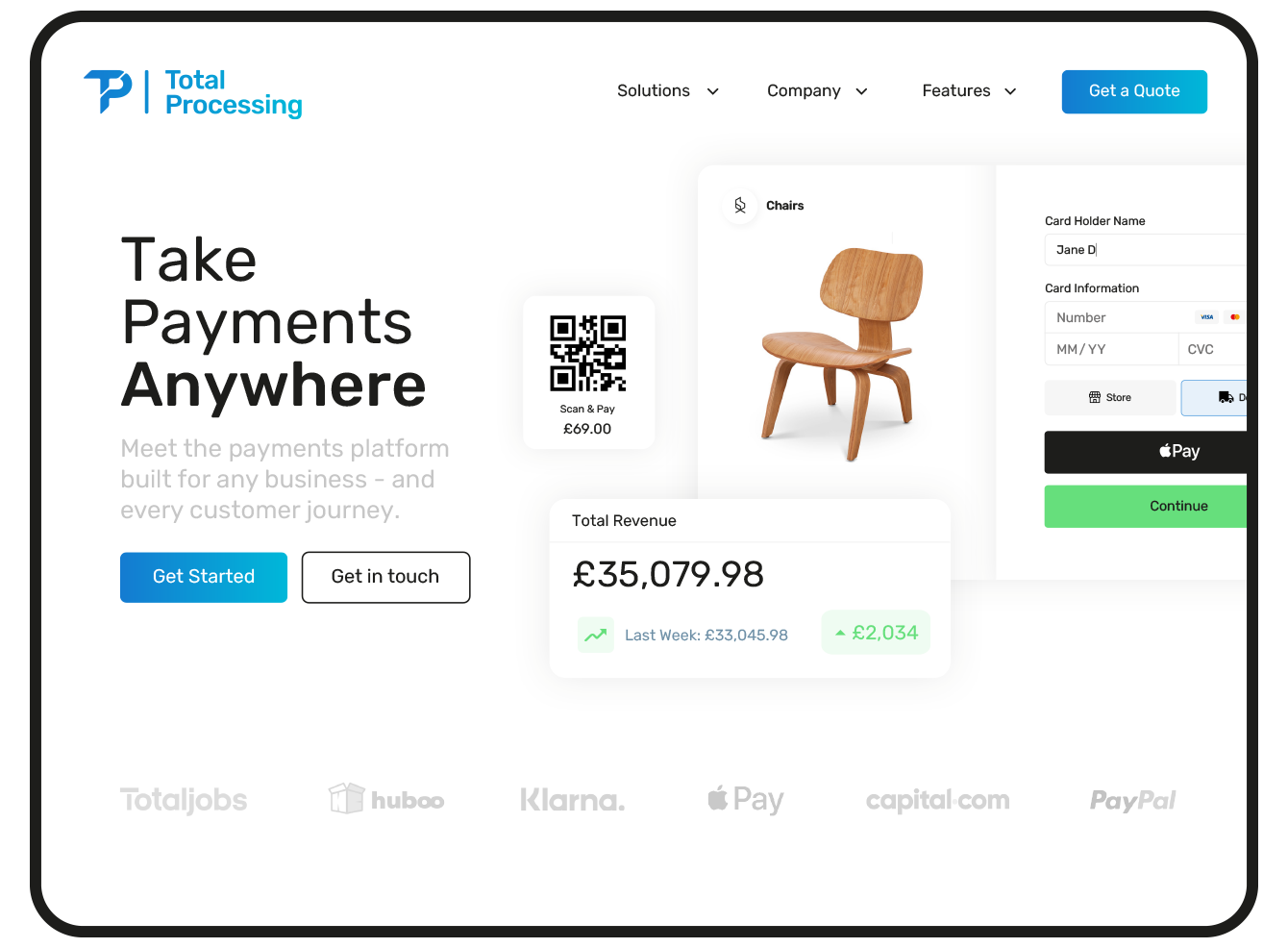
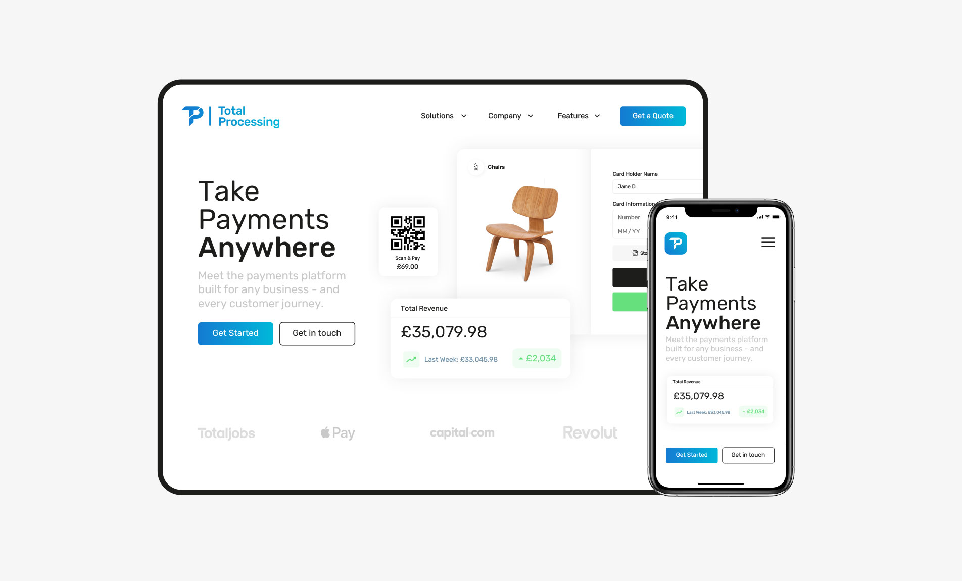
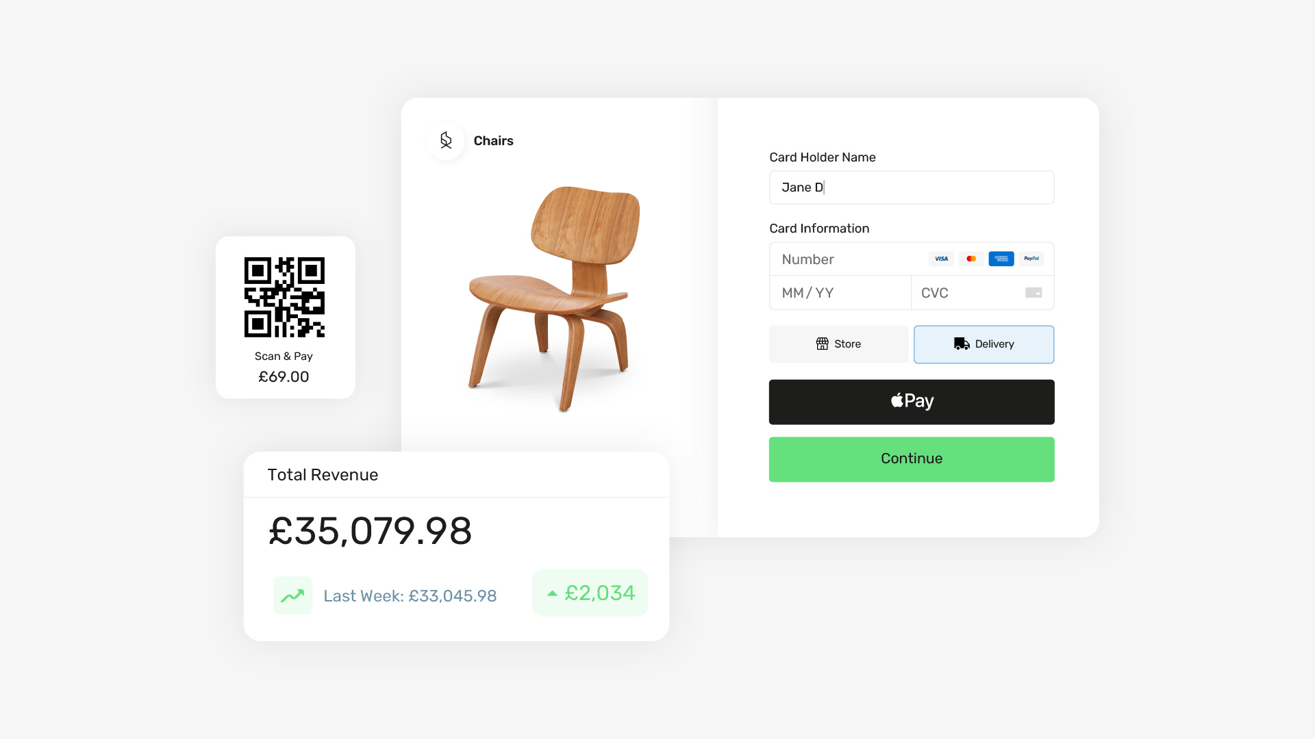
Total Processing Meet the payments platform
Total Processing approached us for assistance in developing their brand into a modern, bold-looking Fintech company.
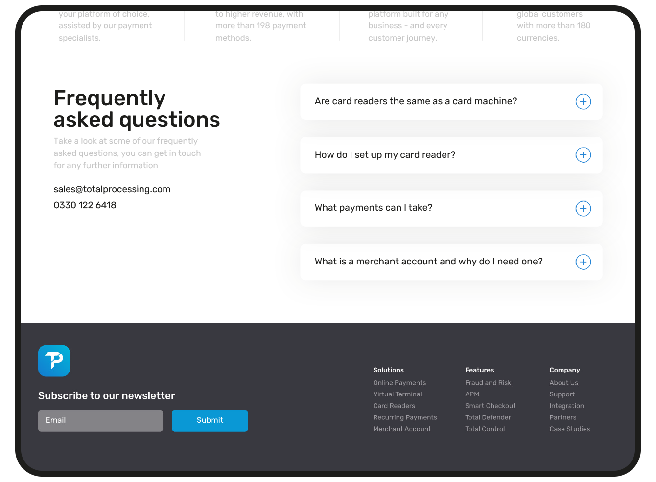
They operate within the world of payments. It’s complex stuff, but our job is to make it simple and visually appealing
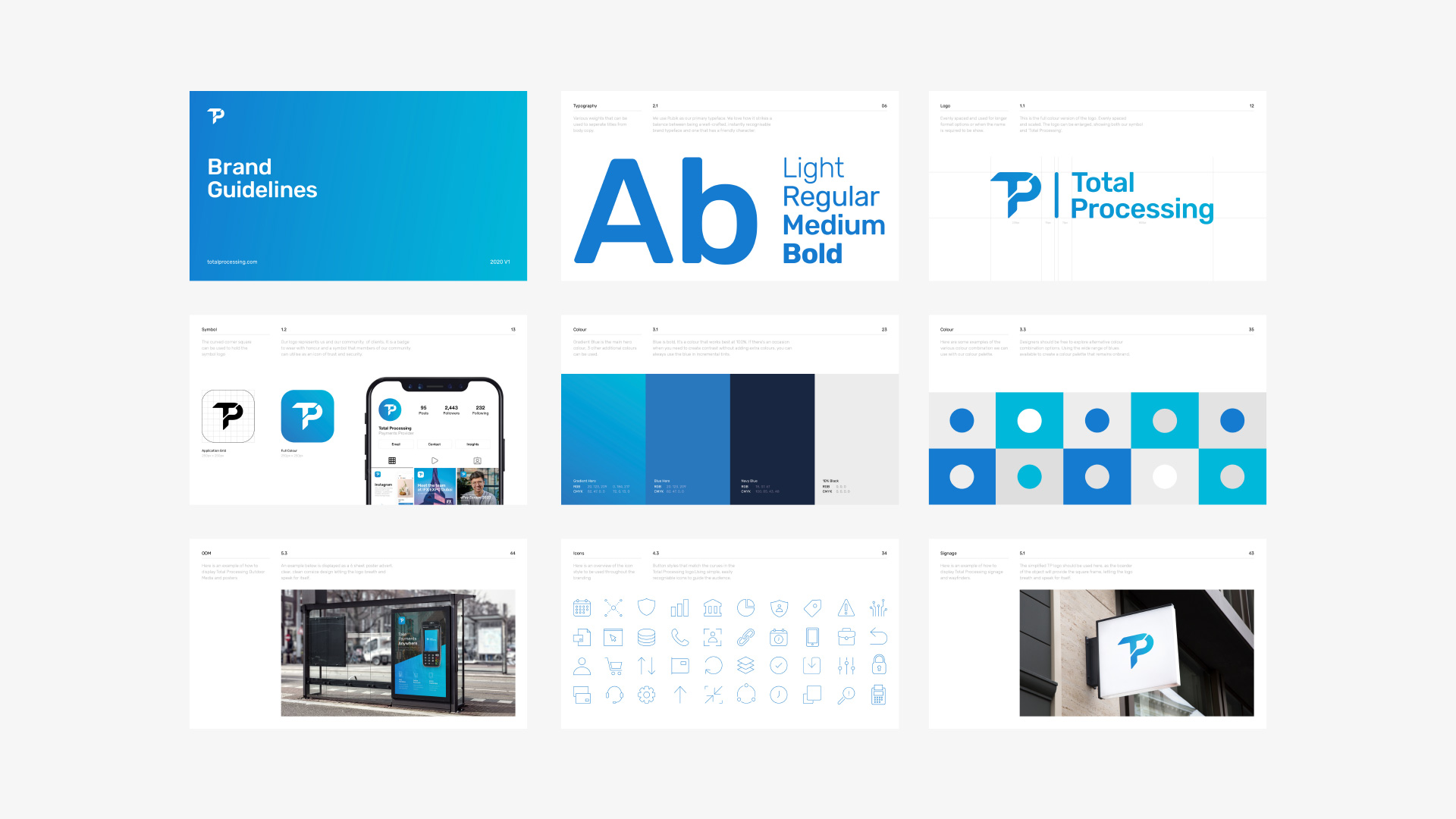
A modern Fintech Brand
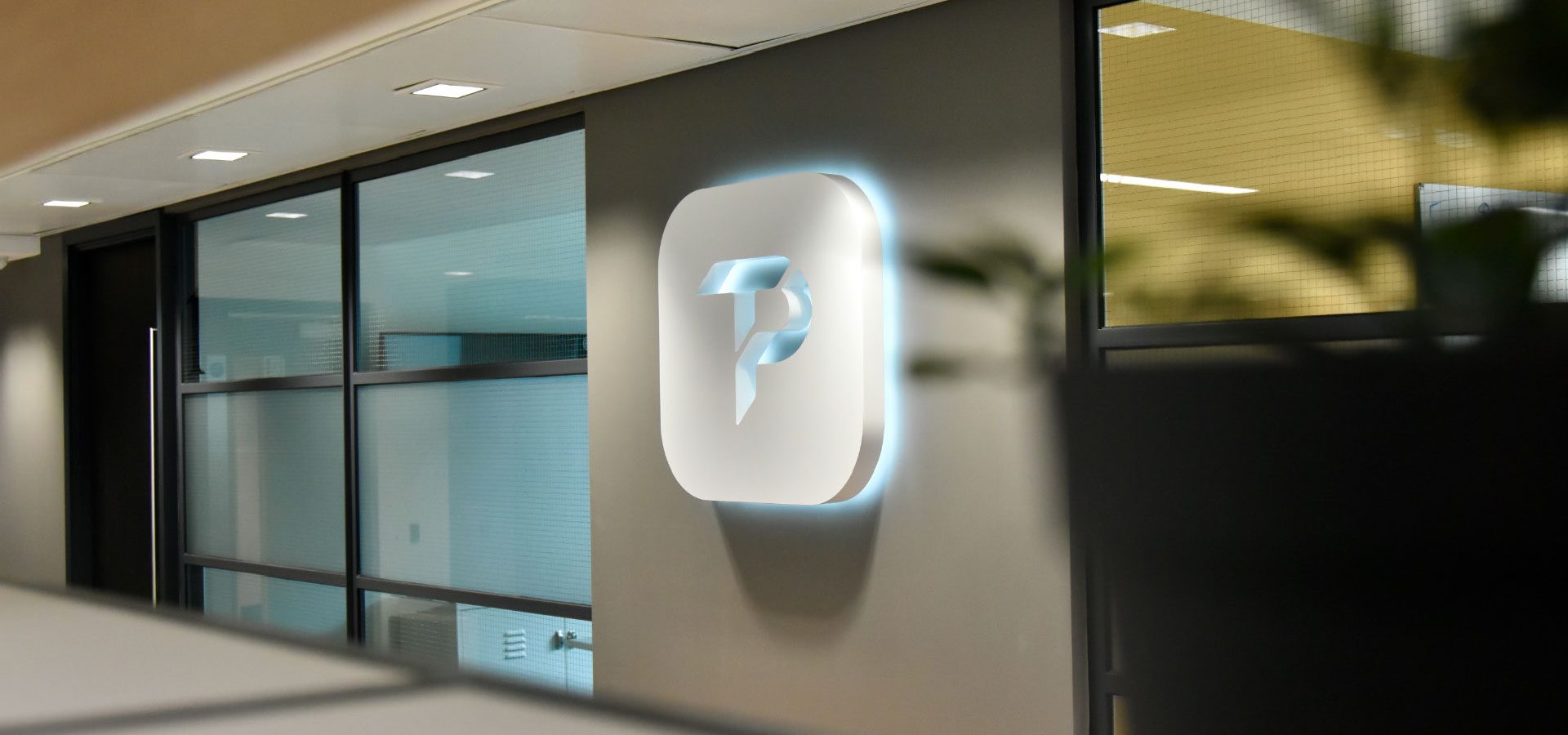
With a mission to reposition Total Processing as a contemporary and dynamic brand, we started by crafting a symbol that would capture the essence of their vision.


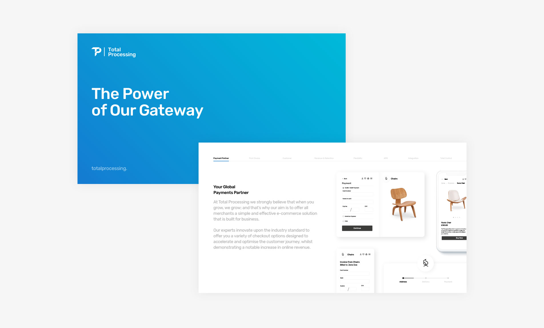
Curves, gradients & rounded corners
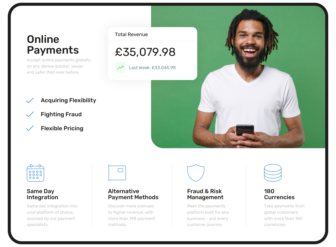
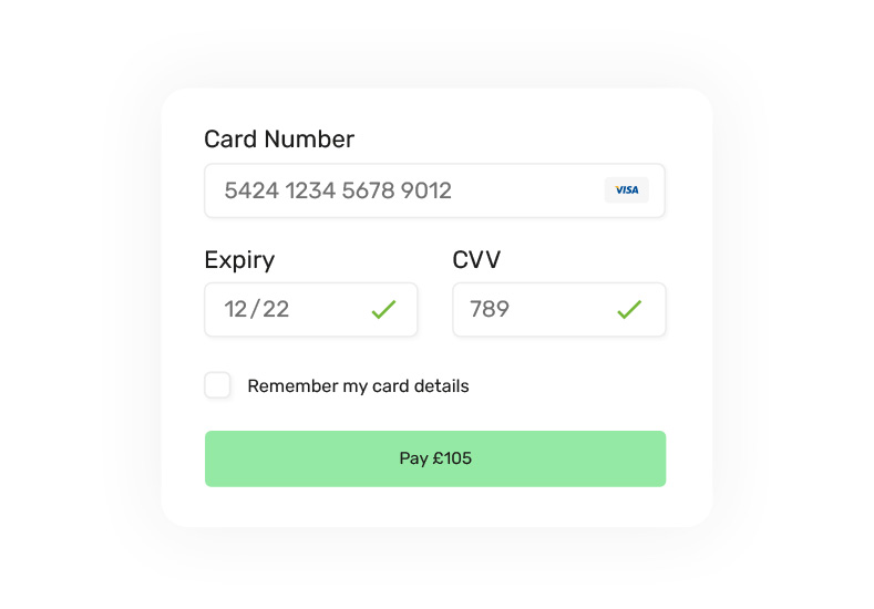
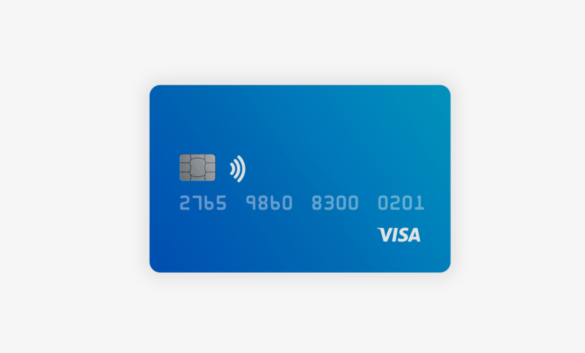
Curves, and rounded edges became central to the Total Processing brand. This simple adjustment gave a subtle nod towards payment and credit cards.
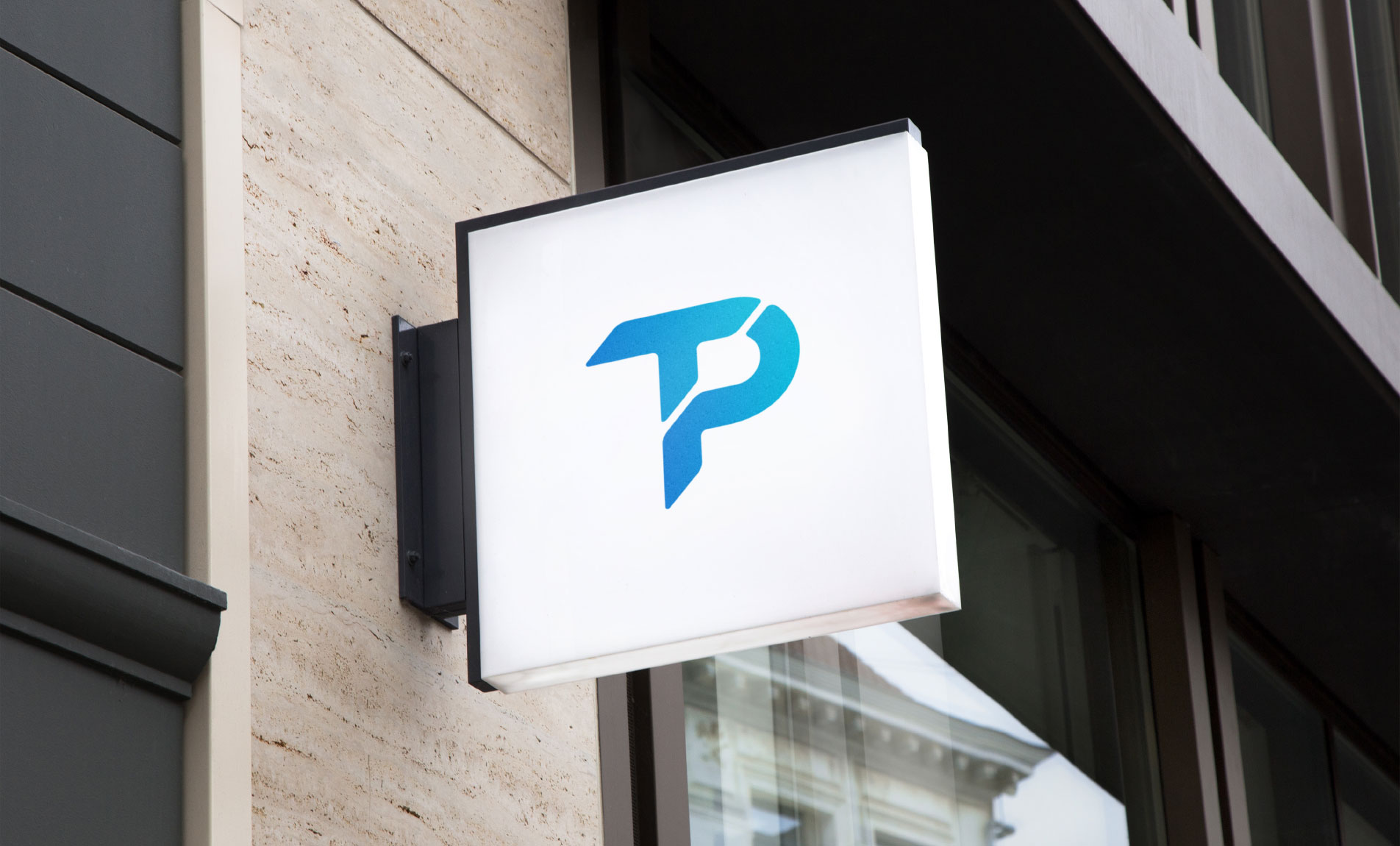
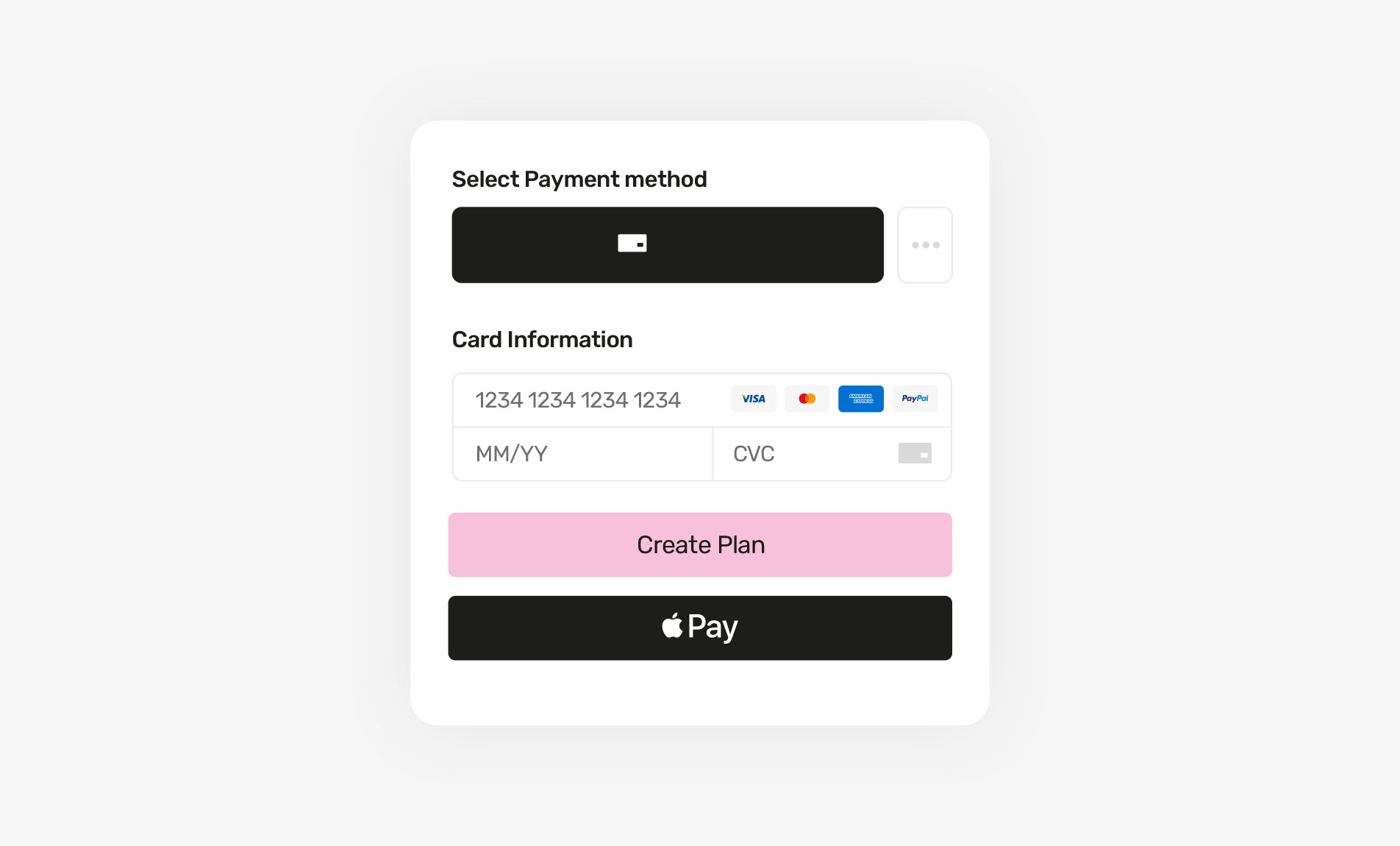
Drawing inspiration from the organic curves found in credit cards, a new symbol emerged—a testament to the brand’s evolution and forward-thinking nature.
A subtle nod towards the organic curves found in credit cards and online payments

Delving deep into the essence of your vision, values, and aspirations.
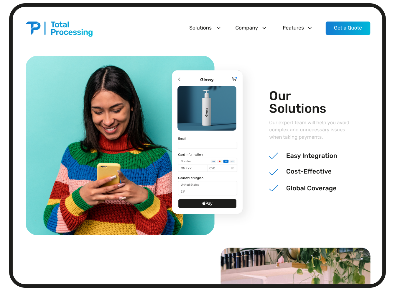
Emerging as a sleek and contemporary brand that commands attention and inspires confidence. This transformative evolution has elevated it is brand authority, reinforcing it is position as a trusted and reliable partner in the industry.

“A great team and a pleasure to work with. They have lots of ideas when it comes to design and helped grow the business into a brand we are truly proud of.”
Abdullah Abdelkafi Head of MarketingSee more work
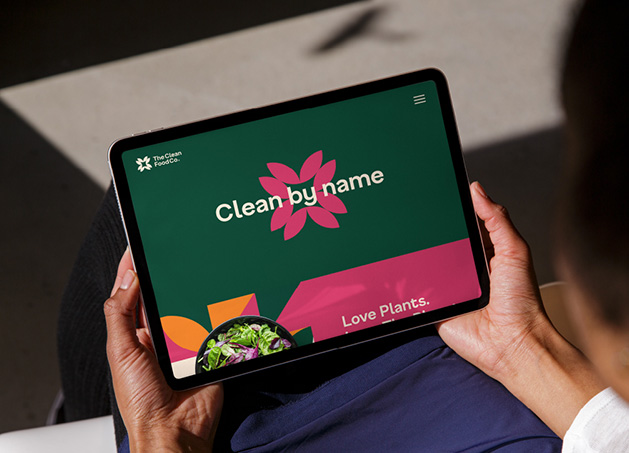
Sustainable food
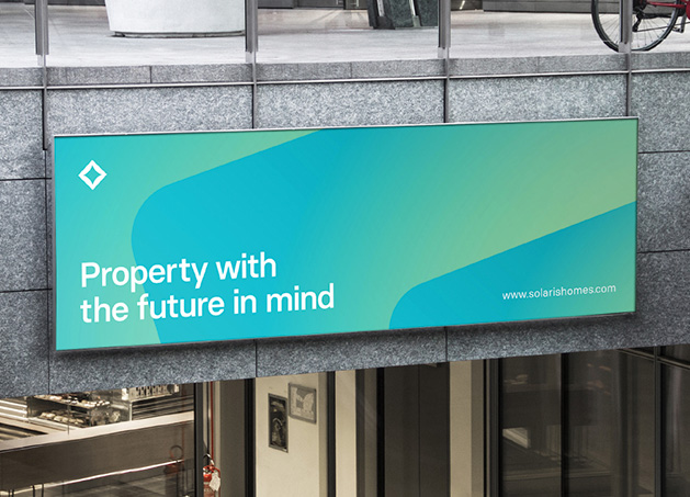
Property development
Creative conferences
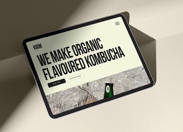
Organic Kombucha
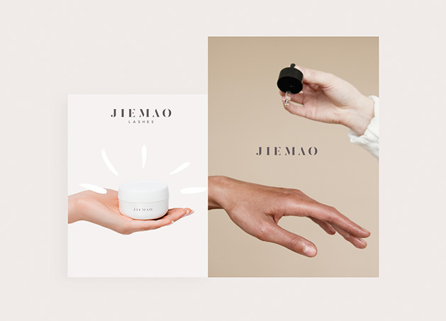
Beauticians

Padel Tennis
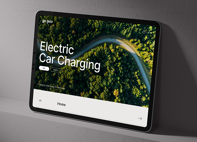
Electric Vehicle Charging

Private Chef

Authenticator technology
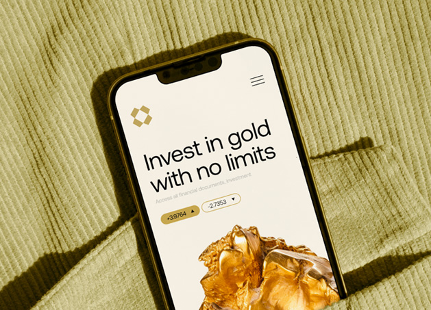
Invest in Gold

Sports & Fitness App
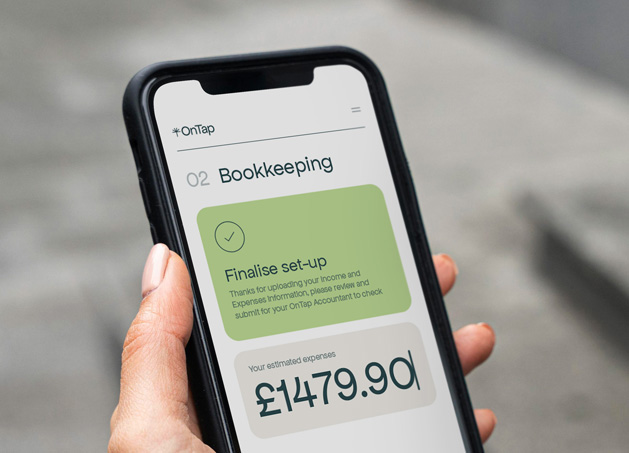
Finance & Accounting
Yacht charter

Finance & Accounting
Payments platform